Every year, we get excited to see what will be announced as the standouts in a sea of color inspiration. In the world of fashion and design, there are seasons for everything. Recently, the Pantone Color Institute revealed the palette to watch for 2026. There’s depth, curiosity, and playfulness in the way colors can work together to create an exciting look for your home.
A Playful Palette
We turn to Laurie Pressman, of Pantone Color Institute, for her inspiration with a Pantone palette. She loves the contrasts and shades, the piecing together of some natural hues with warm, rich tones that feel inviting. With some oranges and yellows that inspire the feel of a sunrise or sunset, to blues and greens that pull from nature, something is exciting about discovering your home’s palette and what each room can look like.

Effortless Neutrals
Ah, those neutral tones. Who can avoid talking about what to do with these understated, beautiful colors? Our inspiration comes from the muted tans, soft browns, and calming grays that perfectly complement bolder colors. Whether it’s natural textures or vibrant patterns, neutrals are like a home base for your space. Cool, calm, and collected. These colors invite us into a unique, comforting world with the right mix. Pair with a gorgeous window shade or drape for a lovely, curated canvas.

Earthy Inspiration
Nature is the effortless color inspiration we all need this season. Home design often finds its foundation in earthy neutrals, natural colors, and soft tones. With warm browns and rich textures, we can draw on the outside world to give an inside point of view. Creatively speaking, we love natural layers paired with some bolder accents. Nature doesn’t have to be neutral, just look outside! Wild and bright birds and flowers, trees with their effervescent bark, are where we draw texture inspiration from to create a look we love in our homes.
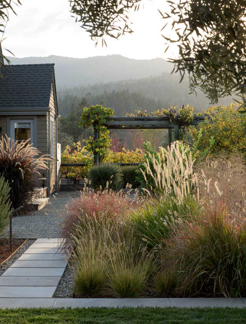
Dining Room Delight
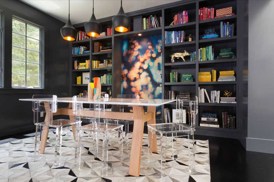
The dining room is a place of deep conversations, light-hearted fun, shared conversations, and perhaps some quiet times as well. This space can be multi-dimensional, which means it deserves a clever, creative approach to color. Give some moody shades a try with deep, bold colors accented with some lighter decor pieces. Bring your own aesthetic from modern to minimalist, warm to cool colors, and everything in between. Create a beautiful room with a palette that lets color inspiration elevate your style and keep conversation flowing.
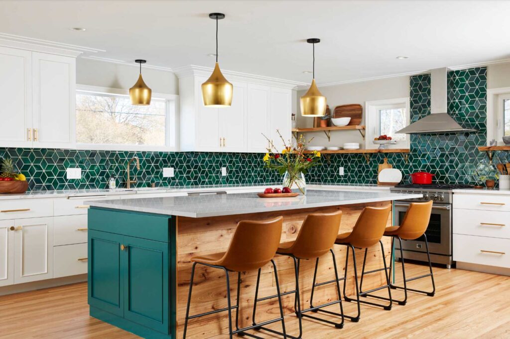
Kitschy Kitchen
Picture this: Step into a playful, artfully designed kitchen with a palette of rich, dark colors in greens and tans paired with elegant window coverings curated for the space. White accents pair nicely with classical colors to create a living dream. Cook, dine, and entertain in your place of joy. Think less utility and function and more kitschy, creative pairings of color that create a stunning masterpiece suitable for all occasions.
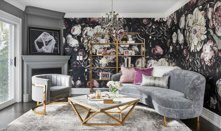
Living Room
While an inspired living room with super-luxurious decor and carefully curated pieces sounds great for some, others might want more muted, understated options. That’s why we love Pantone’s palette this season. Everyone can be happy finding colors they love, from elegant taupe and grey, to rich reddish hues that pair with carefully selected window coverings and tabletop decor. Natural design is about stepping into the array of color inspiration available, then curating it to be your own. Don’t be afraid to mix and match colors, textures, and patterns for an inspired look.
Bedroom Design
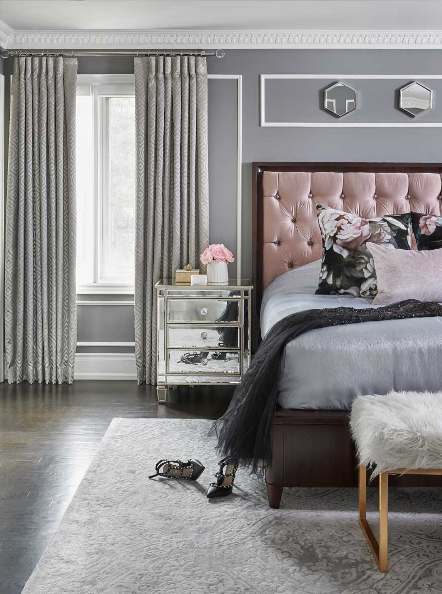
The bedroom is probably the most used room in any home aside from the kitchen (if you love to cook). Why not spend time creating a space you love? Well-designed bedrooms offer style and fun, featuring neutral grays and pinks that pair perfectly with matching window coverings. Other options from the Pantone palette this season are calming blues and fragrant oranges, infused with life and vibrancy to offer a gentle oasis with a side of panache.
Bold and Beautiful Bathroom
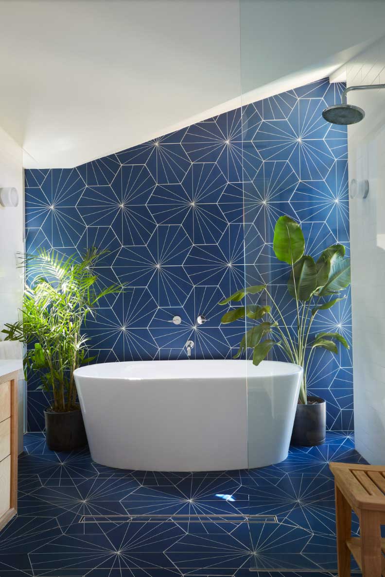
A main goal for creating bold, vibrant color inspiration with bathrooms is the tone. A fresh coat of paint can kick things up a notch from cool jade to deep hues in blues and reds. Sometimes beige can be too muted, but paired with a bolder color, it can pop. Try inspiration from stormy blue to cobalt to patterns against white or a neutral. Accent with the right window coverings, and you have a gorgeous bathroom that everyone will notice.
Is It Time to Get Started?
This year’s color inspiration has everyone talking. When you finally get your home looking the way you want, you deserve to have beautifully crafted window coverings to accent the colors. Contact us to find out how we can show you the products, let you try them out, and see for yourself what will work best in your home. Call today!

